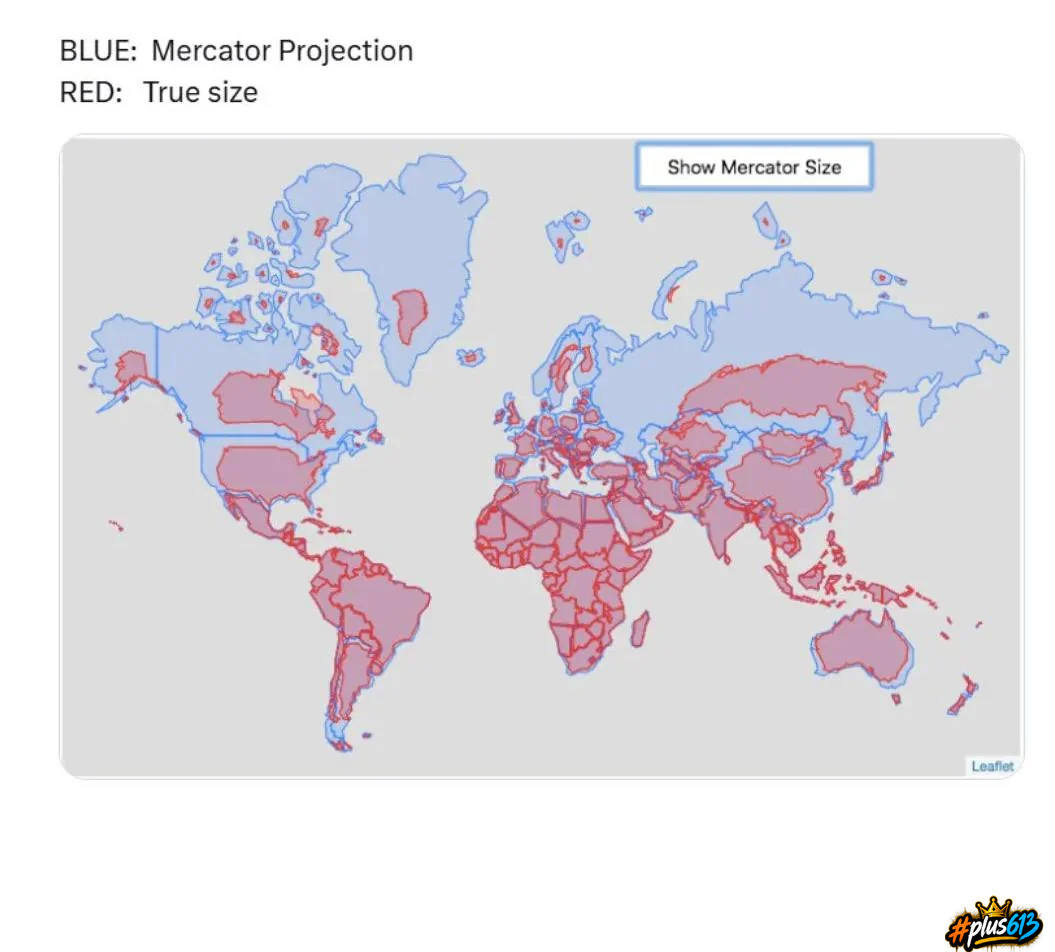
woberto
Report This Comment
Date: September 06, 2026 10:24PM
Makes sense but why change it?
pulse
Report This Comment
Date: September 07, 2026 06:13AM
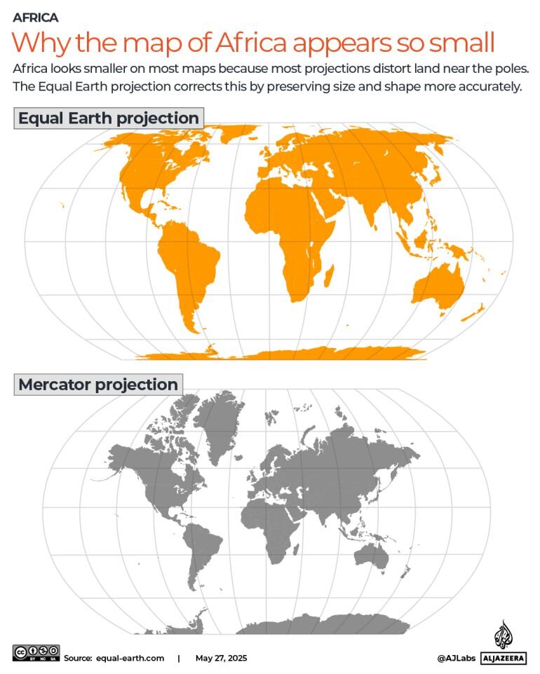
I guess more representative of reality. Mercator is only really somewhat useful for ocean navigation.
Interesting was something like 164 to 1 vote, only US saying no. I guess don't want to look smaller. Or maybe Greenland won't look as appealing now?
Russia shrinks pretty significantly, too.
quasi
Report This Comment
Date: September 07, 2026 09:17AM
The current government of the U.S. and its representatives are uninterested in reality.
woberto
Report This Comment
Date: September 07, 2026 10:56AM
If you had to draw a useful map today, having never seen any of the previous projections, this get's an A+ but if it ain't broke don't fix it.
World maps are not about scale rather they are to help show the distance between the major places on the globe.
pulse
Report This Comment
Date: September 07, 2026 11:15AM
Except some things it grossly exaggerates, and some things under-represents size/distances between places.
pulse
Report This Comment
Date: September 07, 2026 11:19AM
Also, it was really designed to put the UK in the centre of the world, which is why it distorts so much nearer the poles.. It's much higher up than the old maps showed it to be.
woberto
Report This Comment
Date: September 09, 2026 08:33AM
I've changed my mind, I really like it now.